Fence company logos: Quick Guide & Local Options
Fence Company Logos: Why a Strong Logo Matters for Your Fencing Business
When people think about growing a fencing business, they usually focus on services, pricing, reviews, and local visibility. All of those things matter, but there’s one branding element that often gets overlooked even though it shapes first impressions almost instantly—your logo. A well-designed logo can make a fencing company look more professional, memorable, and trustworthy from the very first glance. That’s why fence company logos play a bigger role in business growth than many owners realize.
Whether a customer finds your business through Google, a truck wrap, a yard sign, social media, or a business card, your logo is often one of the first things they notice. In a competitive local service industry like fencing, that visual identity can influence how seriously people take your business before they ever make a call.
Why a Fence Company Logo Matters More Than It Seems
A logo is not just a decorative graphic placed on a website or invoice. It represents your business identity. It tells potential customers whether your company feels established, modern, reliable, premium, family-owned, affordable, or high-end.
For a fencing company, trust matters a lot. Homeowners are inviting a contractor onto their property, often for projects that affect privacy, security, curb appeal, and property value. If your logo looks outdated, rushed, or unprofessional, it can create doubt before a customer even sees your work.
On the other hand, a clean and memorable logo can instantly make a business look more polished and credible. That doesn’t mean it has to be overly complicated. In fact, many of the best fence company logos are simple, recognizable, and easy to use across different platforms.
What Makes a Good Fence Company Logo?
A strong fencing logo usually reflects the nature of the business without trying to do too much. It should be easy to recognize, easy to read, and versatile enough to work on everything from a website header to a vehicle wrap or yard sign.
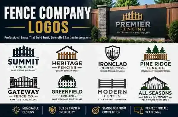
Many fencing companies naturally lean toward visual elements like fence panels, gates, wood grain textures, shield shapes, rooftops, tools, or property outlines. These can work well if they’re used thoughtfully, but the design should still feel clean and balanced rather than cluttered.
The best logos are often the ones that communicate professionalism while still feeling relevant to the fencing industry. A logo should look just as strong on a small social media profile image as it does on a large banner or truck decal.
The Role of Color in Fence Company Logos
Color has a big influence on how a brand feels. For fence companies, logo colors often lean toward earthy, strong, and dependable tones because those naturally connect with construction, outdoor work, and home improvement.
Black, dark green, navy blue, gray, brown, and deep red are common choices because they give a sense of stability and trust. Some businesses also use wood-inspired colors or metallic tones depending on whether they focus on wood fencing, ornamental iron, aluminum, or modern custom fence installations.
That said, the right color palette depends on the brand personality you want to create. A high-end custom fence company may want a more refined and premium look, while a family-owned residential fence company may prefer something warmer and more approachable.
Fence Company Logos and Local Branding
For local service businesses, branding isn’t only about looking good online. It also needs to work in the real world.
Fence company logos often appear on yard signs, uniforms, trailers, invoices, estimates, business cards, social media profiles, Google Business photos, and wrapped service vehicles. That means the logo has to remain clear and recognizable in both digital and physical spaces.
A logo that looks great on a website but becomes unreadable on a yard sign won’t help much in local marketing. This is why practical design matters. Simplicity, spacing, and font readability are just as important as creativity.
Should a Fence Company Logo Include a Fence?
This is one of the most common questions when designing branding for a fencing business. The short answer is: not always.
Including a fence in the logo can be helpful because it instantly communicates what the business does. But it’s not required if the name, typography, and overall design already make the service clear. Sometimes a subtle icon or a strong wordmark can be more effective than an overly literal fence illustration.
The goal isn’t to force every possible visual element into the logo. The goal is to create something that feels memorable, relevant, and professional enough to support the business long term.
Common Mistakes to Avoid in Fence Company Logo Design
One of the biggest mistakes is trying to make the logo do too much. Too many icons, fonts, effects, or colors can make the brand look confusing instead of polished.
Another issue is designing a logo that only works in one place. A highly detailed logo might look fine on a website but become unreadable when printed small. The same goes for logos with weak contrast or thin lettering that disappear on trucks, signs, or embroidered uniforms.
Some businesses also choose generic designs that don’t stand out from dozens of other contractors in the same market. A good fence company logo doesn’t have to be flashy, but it should still feel intentional and distinctive.
Why a Good Logo Supports Marketing and SEO Too
At first glance, a logo might seem unrelated to SEO or local rankings, but branding plays a bigger role than people think. A memorable logo supports click-through rates, brand recall, and trust signals across your website, Google Business Profile, and social media presence.
If a customer sees your company name in search results, then later notices the same logo on a local yard sign or Facebook post, that consistency builds familiarity. Familiar businesses often get more clicks, more calls, and more trust over time.
In that way, fence company logos are not just design assets. They become part of the business’s visibility, recognition, and conversion strategy.
Final Thoughts
A strong logo won’t replace good service, quality fence installation, or a solid local SEO strategy—but it absolutely strengthens how your business is perceived. In a competitive local market, first impressions matter, and your logo is often one of the first things potential customers notice.
Well-designed fence company logos help fencing businesses look more established, trustworthy, and memorable across websites, signs, trucks, and marketing materials. If you want your fencing business to stand out and feel more professional from the first interaction, investing in a thoughtful logo is a smart step that supports both branding and long-term growth.
